
Angels in the Architecture, pt III
On the limits of 3M's Visual Attention Software in architectural research

[This is a the third in a series of long posts with a lot of images. If you’d like to go back to the beginning you can do so here. Consider clicking over to the Substack site if the images won’t load fully in your inbox.]

Welcome back to the third installment of this ongoing slog through the world of Visual Attention Software—a tool for algorithmic simulation of eye-tracking studies. The first post looked at how VAS works and some of the challenges faced when using the tool on stylized drawings of buildings. The second examined some mathematical attempts to score or rank photographs of buildings with VAS. And two brief interludes investigated some of the competing eye-tracking tools on the market.
A lot of what I‘ve written so far has concerned how we interpret the outputs of VAS: the heatmaps and gaze sequence predictions generated by the algorithm. This time around I want to look more closely at inputs—that is, the images on which VAS analyses are performed. What makes a drawing or photograph a good candidate for eye-tracking simulation? What are the best practices around selecting imagery for VAS analysis and how do we determine what “best” would mean in this context?
The research around which this post is organized is a 2021 paper by Alexandros Lavdas, Nikos Salingaros, and Ann Sussman. The paper is something of a grab bag, employing VAS to analyze photographs, edited photo-collages, computer-generated and hand-drawn geometric patterns, and an illustration of a lion. I won’t cover each analysis in depth, but there are a few interesting choices made by the researchers worth discussing briefly.

The matrix of four images above (grouped as Figure 3 in the paper) is presented as a demonstration of the superior visual coherence of traditional designs: “The comparative results are identical, with the glass façade behind completely ignored in each case, while the heatmap distributes practically over the whole pre-modern building, with hotspots at windows or other appropriate structural details.”1
Not discussed in the paper—and possibly not even considered—is the effect of the relative positions of the buildings in question. In the cases above, VAS is predicting higher levels of engagement on the buildings in the foreground. Assuming the predictions are accurate, is this behavior something to do with the buildings, or a function of a human tendency to focus on objects closest to us?
Below are two images I found online, cropped to roughly the same field of view as the images above and analyzed with VAS.

If the salient feature here is the design and materiality of the buildings in question, I would expect to see results symmetrical with what’s published in the paper (i.e. an even heatmap covering the more traditional structure behind and a lack of predicted attention anywhere on the glass facade in front). For whatever reason, that’s not happening with these images. …
Let’s keep moving.
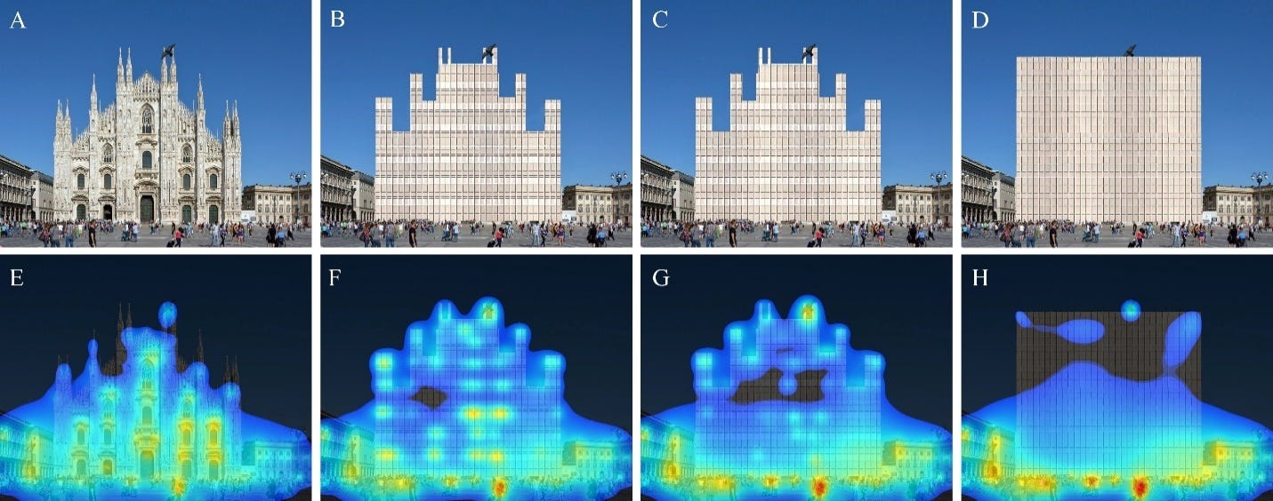
The set of eight images above is another example from the paper, given there as Figure 9. The authors give the following explanation about the initial image chosen, the modifications made, and their interpretation of the results:
“In Figure 9, in a photograph of Piazza Duomo in Milan, Italy (A), The Duomo Cathedral has been replaced by a curtain wall face of similar color (B) that gets progressively simpler, first by losing one set of horizontal lines per floor (C). In the same simplifying sequence, the façades progressively abandon the complex fractal skyline of the original building for a square profile (D). The heatmap coverage diminishes with decreasing complexity. The people, the flying pigeon, and the surrounding buildings are always within the heatmap, but become gradually “hotter” as the central object building attracts less and less coverage.
Figure 9 reveals how interest fades as an iconic building loses detail and fractal scaling; we do not believe that anyone has ever demonstrated this important phenomenon before. These sequences of images are very powerful and really drives home how the architectural experience is controlled subliminally, and not by the conscious brain. We have here an incredible and compact recapitulation of the evolution of architectural design during several centuries.”
I’m not sure what to say about this exercise, except that it doesn’t strike me as particularly rigorous. At the risk of restating the obvious, only one of the facades above (A) represents a real design for the Piazza Duomo. The other three images are Photoshopped caricatures of architecture, and not particularly competent ones at that. Spend any time at all looking at actual curtain walls and you’ll notice this is not how light and shadows behave. Think about the interior of a cathedral and its construction requirements and you’ll notice that the proposed changes don’t make any sense spatially or tectonically. And so on. How valuable is the comparison of a building that doesn’t exist and never would compared to an actually existing cathedral?
But—one might protest—is the Photoshop really all that detached from reality? There are plenty of modern and contemporary buildings with simple rectangular facades divided into regular grids, even ones opening onto wide plazas like this scene in Milan.
Yes, there are plenty of examples to choose from! It’s unclear to me why the authors prefer this progressive collage approach to comparing two or more fully realized buildings.
One possible reason is that VAS analysis of modern and contemporary buildings frequently produces the sort of uniform coverage that the authors claim is unique to traditional architecture. Below is a photograph of Gordon Bunshaft’s Beinecke Rare Book and Manuscript Library on the Yale campus in New Haven.

For proponents of VAS-driven design, the heatmap above represents an ideal result. (This photograph would score a perfect 100 in the Visual Coherence Index introduced in another paper by Lavdas and Salingaros.)
If we wanted to improve upon perfection, though, we could do the Piazza Duomo routine in reverse, progressively collaging bits of traditional architecture onto this base. Here’s what that process looks like:

I’ve tried to keep the visual approach here similar to what’s presented in the paper, meaning I’ve made no effort to render this space convincingly or maintain any of the scales, proportions, or design principles which underlie gothic cathedral construction. The result looks goofy and unserious because this exercise is goofy and unserious.2
But let’s keep moving.

A particularly baffling moment comes near the end of the paper, where Lavdas, Salingaros, and Sussman introduce this drawing of a lion. The lion is presented not as any sort of test for architectural applications, but rather a demonstration of the idea that a "coherent" image is not always a pleasant one:3
“Pre-attentive image processing is more efficient if the image is coherent. In the model of this paper, this means that such an image will show a fairly intense and uniform coverage after using the 3M-VAS software. Any deviations from geometrical coherence are revealed either as large holes or as disjointed hotspots in a 3M-VAS scan.
Geometrical coherence can also promote fear, like seeing the Lion’s face. When you perform a 3M-VAS scan of a Lion’s face, you do get a uniform blue glow. There is no contradiction here. We are wired to respond to threat before we know what we are looking at, including fear responses; for example when predators appear in our visual field…After rapidly identifying the visual information, our brain can promote a further, conscious fearful response if appropriate.”
I’m open to the idea that our brains are primed to respond to known or suspected threats faster than unknown or indeterminate visual stimuli. But I’m also open to the idea that things like color, tone, and texture influence our visual perception in ways that aren’t fully captured by black-and-white line drawings.
If the evolutionary imperative being demonstrated here is “quickly recognize and react to things that look like lions,” actual photos of lions seem more appropriate. A few examples and their VAS outputs:

I’m not sure any of the above reach the level of “uniform blue glow” shown in the drawing. Hotspots are more intense and fragmentation more extreme, but all three are probably a closer approximation of our ancient ancestors’ experience of seeing a lion in the wild than the drawing is.
Is the decision to use a sketch rather than a photograph to demonstrate this idea about identifying threats disqualifying? No. But is it a weird choice? Absolutely, especially given the divergence in VAS results between sketch and photo. (And, as with the previous example, it’s not as though it would’ve been impossible or even difficult to find an actual photograph of a lion to analyze.)
Any use of VAS, architectural or otherwise, entails certain choices: how many images should be analyzed? How many different views or levels of magnification are sufficient? Should we prioritize “realistic” views—taken at eye-level with whatever context exists on the site naturally? Or should we strip away everything but the building itself, perhaps even using drawings or renderings instead of any photographs at all?
Lavdas, Salingaros, and Sussman have some recommendations:
“A meaningful study should use photos with high enough resolution to display that complexity, otherwise the software will miss the finer textures of the buildings being compared—for example, individual bricks and tiles should be easy to discern. The image should be sharp, not an upscaled low-resolution image, as lost information cannot be retrieved. If the image blurs textures on a very basic building, there is nothing much left. Of course, since color plays a role, it should be clearly shown. You do not want the software to effectively see only a simplified version of the building.”
This all seems reasonable enough. Aside from this general guidance, the paper introduces some specific recommendations around six particular components of image selection and preparation. Below is an abridged version of this list of recommendations.
Clouds: “The cloud outline in an image is likely to divert pre-attentive gaze from the building of interest; this is in addition to reducing the contrast of the outline of a white or very light-colored building. Replacing the clouds with a homogeneous blue background sampled from nearby clear sky areas is the best way to avoid both of these issues…Dispelling that this is in any way a limitation of the software, the photographer could wait until the clouds have cleared.”
Shadows: “Shadows on any part of a building cause that area to be incorrectly scanned…[T]he dynamic range of digital sensors, and also the dynamic range of film, in case of scanned film images, is lower than that of the human visual system, and only images acquired using the high dynamic range (HDR) method approach the eye’s dynamic range…Therefore, there should ideally be a bright, even illumination on an examined building, and when two or more buildings are compared in a scene, that they are all equally well illuminated.”
Contrast: “Contrast, either in intensity or color, is important for the software to correctly register the building’s forms…Color saturation is another factor, which promotes clear distinction of forms of different colors.”
Framing: “If the building or structure of interest is tightly framed in the image, a new, monochrome frame could be added, preferably using a color sampled from the sky, to avoid peripheral parts of the building receiving less “attention” by the software…This intervention actually resembles the real-life situation in which we are viewing a building more faithfully, where it normally does not occupy all of our visual field.”
People: “People are always looking for people…This attention bias prioritizes persons in a scan. While possibly interesting for some analyses, it is worth keeping in mind if one is interested in recording pre-attentive reactions to a building without any hotspots specifically related to human presence.”
Distance: “A comprehensive analysis of a single building should ideally use a sequence of image scans taken at different approaches. In buildings that do not have enough organized complexity, then the closer you are, the less coherently they will register.”
I’m not sure how to parse some of these recommendations. Some of the guidance, like removing clouds and people from photos, pushes us in a more abstract, analytical direction, so that VAS turns its artificial eyes solely on the architecture at hand.4 But other suggestions, like adding image frames or manipulating brightness and contrast, seem designed to bring VAS input images closer to actual human visual perception. And in some ways, they still seem arbitrary: why add a monochrome frame with color sampled from the sky rather than one with color sampled from the ground plane? Why not gradually fade out the edges of images to some neutral tone instead of introducing a hard-edged frame at all? Or, why not tackle the lighting and framing issues concurrently by using some sort of modified spherical HDRI imagery instead of rectangular JPEGs and PNGs?
My concern is not that these suggestions for improving VAS inputs are inherently wrong. Some of them, like getting rid of people in the foreground, probably do help focus VAS analysis on those parts of an image most under an architect’s control.
What bothers me is the underlying assertion that these recommendations bring input imagery and VAS outputs closer to some perfect ideal. The two quotes below are straight from the paper, though the italics are my own.
“Failure to optimize some of the image parameters may give scans that could lead to erroneous conclusions.”
“The software is easy and straightforward to use; nevertheless, after processing many images, we discovered some tricks that helped us to get a more accurate reading on the points of architectural interest.”
Erroneous relative to what? More accurate in what sense?
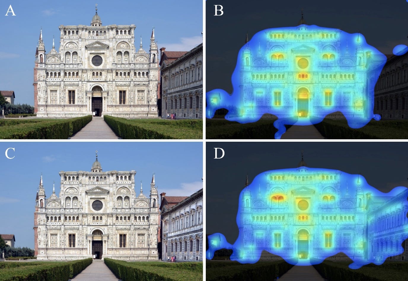
Let’s look at two final examples. Below is a set of images given in the paper as Figure 2.
And the authors’ interpretation of these results:
“In Figure 2, we used a photograph of the Certosa di Pavia monastery church in Pavia, Italy. The entrance door and windows are logical hotspots, and the heatmap covers all of the building. In the first row (A/B) the software ignores the wing on the right because it is in shadow. But this limitation is easily circumvented. In the second row (C/D), artificially increasing the brightness and contrast of this part in shadow makes its details more visible to the software, and now the wing on the right is also part of the heatmap area. This example establishes one of the key results of these scanning experiments: a high degree of organized complexity achieved through nested symmetries engages the viewer.”
This is the example the authors refer to when making their suggestion about even illumination. That half of the building only appears in the VAS heatmap is described not as a limitation of the building, but rather of the software. Adjusting the brightness and contrast merely corrects the input allowing the software to see what the authors believe it should see.
Contrast that framing with this image and VAS output, part of a set of results presented in Figure 1.

The published interpretation:
“Here, we see a typical situation in real street scenes: minimalist glass-façade buildings are more or less ignored, despite their dominant size. The neoclassical building of the Royal Exchange Theatre from the 1860s on the left is practically the sole focus of pre-attentive attraction, with main “hotspots” in areas of rich detail. There is also some attraction to the road level with people and cars, to the edge of a cloud and, to a much lesser degree, to some reflections and other areas of contrast in the modernist-style buildings.”
The building on the right, photographed obliquely at this particular time of day and in this particular light, takes on the color of the sky and is darker in value than the facade of the Royal Exchange seen head-on in the foreground. What happens if we adjust the lighting and contrast of the right side of the street to a degree comparable to the edits made to the monastery from Figure 2? Lavdas, Salingaros, and Sussman didn’t attempt this (or at least didn’t publish it if they did), but it’s not particularly complicated.
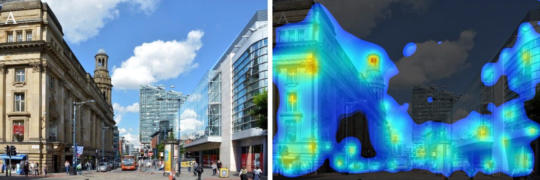
And just like that, VAS predicts our attention will be drawn far more to the right side of the street than it had been previously. Has this made anything more accurate? If so, why? If not, why not?
The results we get from a tool like VAS are only as valuable as the raw images we feed into the system. The authors of this paper make a number of choices about which images to analyze, which to edit for “better” outcomes, and which to ignore entirely. What guides these decisions appears to be nothing more than a predetermined set of expectations around what the results ought to show. Where results fail to meet expectations, one can just use a different image or work down the list of techniques to improve “accuracy” until a more pleasing heatmap arrives.
This pattern of decision-making is great for generating scientific-looking “evidence” for pre-existing aesthetic commitments. It’s less helpful for giving us a clearer understanding of what happens in the brain when we encounter a work of architecture.
Of those two goals, which should we be more interested in?
—THA—
Lavdas, Alexandros A., Nikos A. Salingaros, and Ann Sussman. 2021. "Visual Attention Software: A New Tool for Understanding the “Subliminal” Experience of the Built Environment" Applied Sciences 11, no. 13: 6197. https://doi.org/10.3390/app11136197
Eagle-eyed observers may notice that the biggest changes to the heatmap results coincide with changes in massing, not texture or materiality. Indeed, this is the case with the Piazza Duomo example as well, which could call into question some of the authors focus on surface articulation.
The authors of these sorts of studies—to their credit!—clarify that tools like VAS measure what the eye pays attention to, not what it finds pleasurable.
As a reminder, readers, I’m not a neuroscientist or evolutionary biologist. And to the best of my understanding, the science behind how and why we’ve evolved to process certain visual stimuli in certain ways is not 100% resolved and definitive. So take the following with a grain of salt.
The interpretation Lavdas, Salingaros, and Sussman promote seems to treat attention and emotional valence as discrete qualities, which I’ve mapped below as two axes on a very simple chart. (If I’m misunderstanding how the authors’ claims work, I welcome any corrections or clarifications!)
VAS, in this framework, gives us a better idea of where certain stimuli would land on the vertical (attention-grabbing) axis on this chart without giving us any information about the horizontal placement.

In the case of buildings, I imagine this range of stimuli and the reactions they provoke would look something like the following:

What complicates this whole framework is the relationship between attention, attraction, and organized complexity. The language throughout this paper (and others in this vein) is really slippery about complexity’s relationship to beauty and visual enjoyment.
Consider the four findings below, taken from a list of eight given in the paper:
A high degree of organized complexity, defined through nested symmetries, engages the viewer in pre-attentive, unconscious interest.
Visual engagement distributes uniformly throughout a complex, highly ordered composition, with no gaps and few hotspots in the heatmap.
Hotspots in a successful composition’s heatmap coincide with points of functional interest such as the main entry, or prominent windows and other central features.
An unsuccessful (disengaging) composition will show hotspots in irrelevant places such as the building’s corner or edge, or away from the building altogether.
The lion drawing from earlier would seem to be a “successful composition” by the standard in finding 3: the VAS results show an even blue field with orange and red hotspots at the points of functional interest—the creature’s eyes. At the same time, a facade which induces the same mental response as seeing a predator in the wild sounds like a bad thing. When an architect uses VAS to guide their facade composition toward a more “successful” heatmap, what’s to stop them from inadvertently designing a lion?
It’s not mentioned in the paper, but I imagine removing or desaturating extraneous vegetation would “improve” VAS inputs in much the same way as removing clouds.