
Angels in the Architecture, pt I
On the limits of 3M's Visual Attention Software in architectural research

[This is a long piece with a lot of images. So long, in fact, that I’m breaking it up into several separate posts over the next few days. Consider clicking over to the Substack site if the images won’t load fully in your inbox.]

Setting the scene
Picture for a moment, a person walking down the street in an unfamiliar city. They have some time to spare and no particular destination in mind; they’re free to wander wherever they please. Soon, they come across a broad open plaza enclosed by buildings in a wide variety of scales and styles. Will they walk toward any one structure in particular? Will they be paralyzed with indecision? Will they turn around and head back the way they came? How will the buildings they see across the plaza impact their decision?
As architects and planners, we want to make the spaces we design appealing and welcoming to passersby.1 We’ve done well when people feel drawn toward the buildings we’ve made, and we’ve missed the mark when a building feels repulsive or uninviting.
A challenge here is that different people tend to like different things. This is undeniable in the realms of fashion, music, literature, art, cuisine, and so on, and we assume that it carries over to architecture and design as well. That is, we expect our wanderer in the city square to make a decision shaped by their conscious preferences, interests, and past experience. And we would expect different observers to respond to the same scene in different ways.
A burgeoning field of research aims to demonstrate that this isn’t quite true. Rather, it contends, the nature of which buildings we’re drawn to (and which we aren’t) comes from something hardwired into our genetic code, developed through the deep timescales of human and pre-human evolution. Discussed under the banners of neuroaesthetics and cognitive architecture this work seeks to understand what happens at a subconscious level when we encounter a work of architecture, with the hope that one day we might build better buildings based not on subjective theories or ever-shifting cultural trends but on evidence-based hard science.
One of the most recent (and most dangerous) tools in this scientific toolbox is a piece of software called VAS.

What is VAS?
VAS (or Visual Attention Software) is a tool used to simulate how the human eye would behave in an eye-tracking study in laboratory conditions. Eye-tracking studies are, in turn, designed to give insight into how the human eye processes the visual field when confronted with new visual information, like a painting or a streetscape.
As described by the manufacturer:
“The predictive model powering VAS simulates a phase of human vision called pre-attentive processing. Think of this as "first-glance" vision since this phase of vision occurs the moment when we first glance at something. During this phase, our eyes subconsciously gaze at the most salient content in our field of view for a period of up to 3-5 seconds. Pre-attentive processing is an evolutionary trait that is universal across humans – regardless of culture, sex, age, or anything else.”2
Consider the three scenes below:

The first is not too far removed from our previously-discussed person walking down the street: a man stands across the street from a building and looks at it. All sorts of complex stuff is going on here optically: the man moves his head and neck a bit as he looks; his pupils dilate and contract in response to the light; his left and right retinal impressions are synthesized into one single view, and so on. At some point he takes a photograph, capturing a split second3 of this ongoing process of looking at a building.

The second scene is a simplified but not atypical depiction of an eye-tracking study.4 Participants in a computer lab look at still photographs on a computer monitor while a webcam tracks the motion of their eyes. The data from these webcams is then aggregated and summarized, either in visual displays of eye fixations and movements or in numerical terms (“63% of users looked at this portion of the image first”), or often both.

With VAS the link between a human observer and that which is observed is severed entirely. No human is involved in the production of VAS analyses, except for the task of uploading data and clicking some buttons. The entire process happens algorithmically within the program itself.
This is a boon to researchers, as any research involving human subjects is logistically complex and expensive. What VAS promises is a chance to approximate the results one would obtain from research on real humans without having to involve other people at any point in the process.
How does VAS work?
VAS is a proprietary software5 sold by the 3M corporation, who have a clear financial interest in not disclosing the details of its inner workings. That said, we can look at its inputs, outputs, and marketing materials to get a rough idea of what’s going on under the hood.
Every VAS analysis begins with a two-dimensional raster image, like a jpeg or png. You can think of one of these images as a type of spreadsheet, with each pixel having a specific location (column, row) and a value (intensity). For a color image, each pixel has three “channels” for these values (R,G,B), but the basic principle is the same.
In analyzing an image, VAS pores over these spreadsheets, looking for patterns in the pixels it believes will correspond to places in the image where the human eye would focus in an actual eye-tracking study.
What patterns does VAS look for?
Once again, we’re limited here by what 3M chooses to disclose. The VAS FAQs page offers the following breakdown of five different image conditions, stating “VAS predicts the role each of these elements play in drawing our gaze during first-glance vision.”

When searching for the five elements above (Edges, Intensity, Red/Green Contrast, Blue/Yellow Contrast, and Faces), VAS approaches an image from one of nine preset content types. A given image can be examined as if it were:
Packaging (close-up view of a product package)
Print (close-up view of a print communication)
Shelf Set (category or endcap)
Outdoor Macro (outdoor or distant view)
Indoor Macro (down-an-aisle or distance view)
Signage (signage in an environment)
Web Page (website only without the browser interface)
Email (any type of email)
Other (all other image types)
The preset selected makes a difference in what VAS predicts a human would focus on when presented with the image. This is understandable, as things like viewing distance and lighting conditions differ dramatically between, say, walking down an aisle at the grocery store and reading an email at one’s desk.
For a more concrete illustration of this effect, check out the photograph below and three associated VAS outputs.

Here, a photo of the Panthéon in Paris has been analyzed as (from left to right) a piece of product packaging; a sign; and a website. The three colorful Heatmaps indicate where an actual human is expected to look: dark grey areas are least likely (in VAS’s estimate) to catch the eye, while bright reds (“hotspots”) represent areas with the highest probability of attracting attention. Blue, green, and yellow represent probabilities in between.
Again, it’s not surprising (or bad) that the different content types predict different results, but for our purposes it means that any analysis of building facades will only be as accurate as the inputs and settings which produced it.6 (More on this in a future post.)
Let’s look at one more example and introduce one more VAS diagnostic (Gaze Sequence predictions) before moving on to the architectural research itself.

Here’s the primary facade of the Broad Museum in Los Angeles, plus three Gaze Sequence predictions interpreting the building as (left to right) a small piece of print media; an email; and the catchall category “Other.”
While the Heatmaps of the Panthéon represent expectations of where the eye would be most likely to look during the first 3-5 seconds of image exposure, they don’t indicate anything about the order or path of movement. The Gaze Sequences, on the other hand, indicate the first four spots the eye is expected to go, in order.7 VAS anticipates that the same image will pull the eye in different directions (and in different orders) when viewed as different types of media.
The email and website settings, for example, show a strong tendency to produce output that locates Gaze Sequence point "1" in the upper left corner. VAS seems to do this no matter actual the image content, possibly an artifact of our expectation to find important text in that same part of the page across many different emails and websites.
Now, with that preparatory groundwork out of the way, let’s take a look at a study employing VAS in architecture.
I
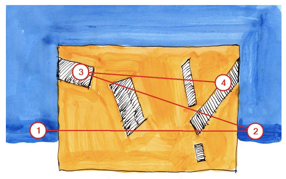
The blue and orange image above is what first piqued my interest in this body of research. It comes from a 2020 paper by Nikos Salingaros and Ann Sussman (“Biometric Pilot-Studies Reveal the Arrangement and Shape of Windows on a Traditional Façade to be Implicitly “Engaging”, Whereas Contemporary Façades Are Not”), published in the journal Urban Science.
The authors describe the VAS results for this image as follows:
“The diagonal windows in this example are totally “disengaging”. The eye looks first on both sides outside the building and only then at the building itself…These findings suggest that this building is barely perceived: there is no cognitive entanglement to draw our attention and create visceral involvement.”8
This could be true, but looking closely at the image reveals something else: deeply saturated areas of blue immediately beneath positions ‘1’ and ‘2’—much darker than the rest of the sky. Compare the depiction of the horizon in the image above with the same area in the image below, which Salingaros and Sussman describe as an example of “engaging” architecture:

Is VAS picking up on some deep structural truth about facade composition, or merely seeking areas of highest intensity and contrast?
In order to test this question, I have redrawn the initial images analyzed in the paper with a more consistent graphic approach. This involved some alterations and a few judgment calls. Wherever questions arose during redrawing, I referred to the description of the initial images presented in the paper:
“The method of analysis presented here uses paintings of five stylized building façades containing several windows. Visual features other than those on which the present model focuses were removed, because the details contained in photos would be distracting to the software…The five dissimilar façades represent simplified versions of traditional architecture, Art Deco, and contemporary design styles…”
"The stylized façades were adjusted to have a roughly similar scale and windows of comparable size. In addition, entrances were not shown in this study, since these draw the eye—or not—and their presence would introduce a separate variable for measurement…Here, we focus solely on the effect that windows and their size, shape, and arrangement have on our perception of a building.”9
Below are the five initial images (with VAS Gaze Sequence results photoshopped out) and the five redrawn versions.

The initial images have facades which vary in area by a few percentage points between images, and windows occupying approximately 10-25% of total facade area, depending on the image in question. In the redrawn versions, the total area occupied by each facade is kept consistent, as is the portion of the facade taken up by fenestration (excluding a few very small differences introduced by the rasterization process).10
Photoshop histogram data provides further information regarding the (in)consistency between images:

My hope at the outset was to rerun the VAS analysis on my redrawn versions using the exact same image size, resolution, and VAS content type settings used by Salingaros and Sussman. I ran into two hurdles with this approach. First, the authors do not specify the exact input parameters used to produce their published results. And second, despite multiple attempts across all five images, I was unable to reproduce any of the Heatmaps and gaze sequences published in their paper. Whether this is a function of backend changes to how VAS works, inconsistencies I introduced in removing the Gaze Sequence labeling to restore the “original” images, or some other factor(s) is unclear.
Without the ability to replicate Salingaros and Sussman’s initial inputs, I have rerun the VAS analysis on both the initial hand-drawn and my redrawn versions of each facade type. Each input image is a png file at 1800px x 1273px resolution in 8-bit RGB color. Each was processed with the VAS Photoshop plugin using the “Other” content type setting. Those results are below.11
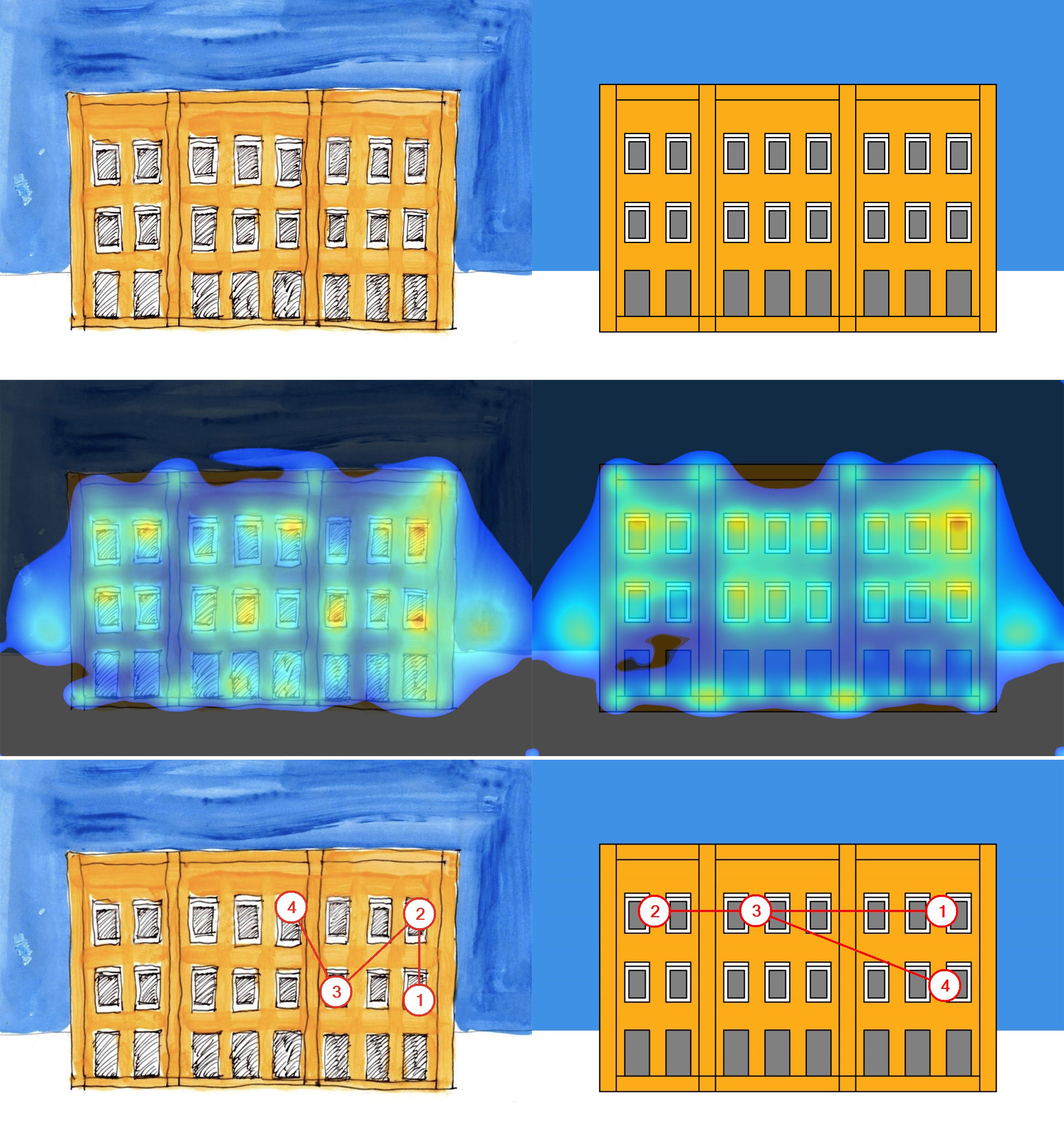


There are broad similarities in the VAS-generated Heatmaps between the left and right columns, but in none of the five cases do the gaze sequences correspond between the initial and redrawn facades. Ironically, my redrawn version of the “Diagonal Slits” facade replicates the published results of eye fixations around the horizon whereas the repeated analysis of the initial image does not. I don’t know how to explain this.
Leaving aside assessments of which facades are “engaging” or “disengaging,” an immediate challenge to any designer or researcher employing VAS will be distinguishing between signal and noise in the input imagery. Expressed another way: have I made the VAS results more reliable or less by standardizing the areas and saturation levels across the input images? Which image set tells us more about how we ought to design the buildings around us? I really don’t know.
Salingaros and Sussman conclude that “Visual attention software revealed clear and dramatic differences of perception among five different stylized façades.”
While the Heatmaps are more ambiguous, the Gaze Sequence results reveal clear and dramatic differences of (algorithmic predictions of) perception among different stylizations of the same facade. These differences are in some cases just as prominent as the differences revealed between facade designs.
In what should be a simple test run with many variables removed, we’re already encountering ambiguity.
How does VAS perform when analyzing photos of actual buildings? And what sort of VAS output would definitively indicate a good facade versus a bad one?
Find the answers (kind of) to these questions and more in the next segment of Angels in the Architecture.
—THA—
This exists alongside other desires and obligations: safety, affordability, function, and occupant comfort, to name just a few. The practice of architecture is full of competing interests and tense tradeoffs and any building we encounter is a record of both noble intentions and tough compromises.
https://vas.3m.com/faqs
An exposure time of 1/200th of a second is not uncommon for an outdoor shot on a sunny day.
Other methods of eye tracking do exist, employing VR headsets or small wearable glasses to take measurements in the field. In the papers I reviewed while preparing this essay, those other methods represented rare exceptions, not the most common practices.
Available as a web-based app or a plug-in for Adobe products. All of the images I processed for this essay made use of the plug-in, but to the best of my knowledge the underlying tool is identical regardless of format.
How do the content types differ from one another in their operation? What’s happening within the software itself that gives different results for each? Good questions! I don’t know for sure. 3M claims that VAS is trained on “hundreds of thousands of data points from academic eye-tracking studies which were then supplemented by 3M eye tracking studies.” It’s possible that the nine different content types each use a different combination or subset of this huge batch of data. It’s possible that the same data is used in every case but the five different elements (Edges, Intensity, etc.) are weighted differently in the final output. It may be some combination of these and/or other factors.
The VAS output is always four locations—no more, no less—regardless of the complexity of the input image.
Salingaros, Nikos A., and Ann Sussman. 2020. "Biometric Pilot-Studies Reveal the Arrangement and Shape of Windows on a Traditional Façade to be Implicitly “Engaging”, Whereas Contemporary Façades are Not" Urban Science 4, no. 2: 26. https://doi.org/10.3390/urbansci4020026
Salingaros and Sussman, 2020.
I had to alter the composition of the ‘Art Deco’ and ‘Vertical Slits’ facades to achieve this equal area between all five, but I felt this was preferable to introducing additional variation in luminosity and color balance by maintaining the original compositions.
If you would like to test for yourself any of the images presented in this essay, I would be more than happy to share them. Email me at the.hustle.architect@protonmail.com for more information.