
Angels in the Architecture, pt II
On the limits of 3M's Visual Attention Software in architectural research

[This is a the second in a series of long posts with a lot of images. If you’d like to read the first installment, you can do so here. Consider clicking over to the Substack site if the images won’t load fully in your inbox.]
In the previous entry in this series, I looked at a 2020 paper by Ann Sussman and Nikos Salingaros, in which 3M’s VAS (Visual Attention Software) was used to demonstrate the superiority of symmetrical facade arrangements in engaging human viewers. Or so it claimed—my contention is that its methods and analyses leave a lot to be desired.
In this post I’ll be looking at a 2022 paper coauthored by Salingaros (again) and Alexandros Lavdas, which builds upon that earlier research.
II
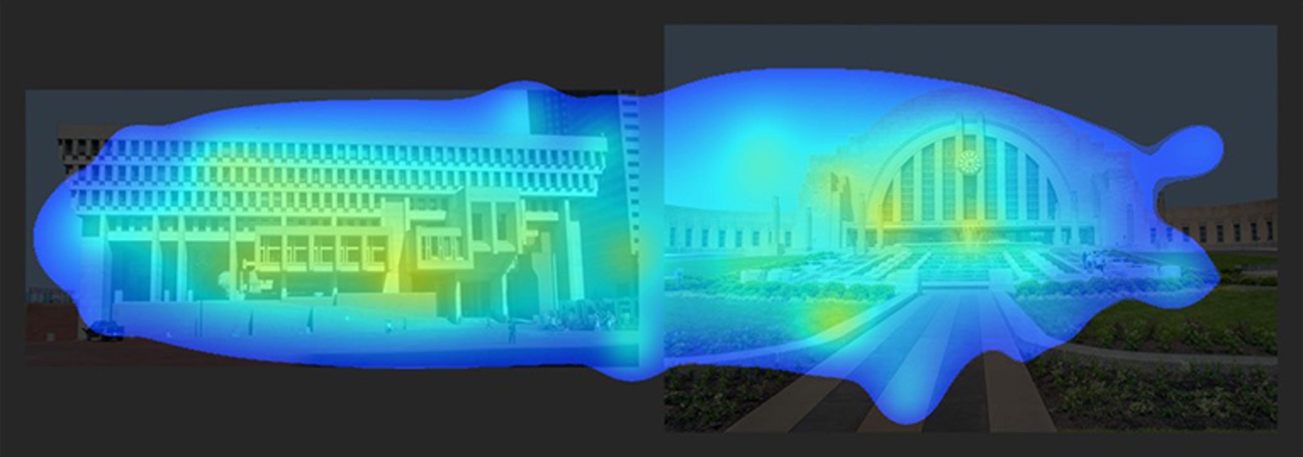
Look at the pair of VAS-generated heatmaps below. On the left is the Boston City Hall, finished in 1968. On the right is Cincinnati Union Terminal, completed 1933.

Which represents the more engaging facade? The city hall, which has fewer stray spots around the edge of the frame? Or the terminal, with it’s symmetrical areas of fixation around the vertical center? Are they both relatively engaging (or relatively disengaging)? Might there be a better, more quantitative way to interpret VAS results?
Let’s turn our attention now to the the 2022 paper “Architectural Beauty: Developing a Measurable and Objective Scale” co-authored by Alexandros Lavdas and Nikos Salingaros.
From the abstract:
“This study discusses two diagnostic tools for measuring the degree of architectural “beauty” and presents the results of the pilot application of one of them...These results support the idea of a feasible, ‘objective’ way to evaluate what the users will consider as beautiful, and set the stage for an upcoming larger study that will quantitatively correlate the two methods.”1
At the outset, I want to acknowledge that yes, this is a pilot study conducted in anticipation of additional future research with (presumably) larger sample sizes, tighter controls, more images, etc. But even with those caveats, I don’t think the authors’ conclusions follow at all from the data presented.
Let’s dive in.
The methodology employed here is complex. I encourage anyone interested to check out this paper—indeed all the papers examined in this series—for themselves and to not take my word for it alone.
A quick summary is as follows:
12 images of buildings were selected from the archives of the Classic Planning Institute.
The 12 images were rank-ordered from least to most beautiful using an (allegedly) intuitive, pre-attentive method called the Buras Beauty Scale.
The 12 images were run through VAS analysis in side-by-side pairs based on this ordering.
The VAS results from step 3 were compared with the rank-ordering developed in step 2.
The 12 images were run through VAS analysis as standalone images twice: once at 100% scale and once zoomed-in 235% and cropped to the same dimensions.
The VAS results from step 5 were processed using another software (ImageJ) to quantify percentages of heatmap coverage and number of hotspots, resulting in a Visual Coherence Index value, R, for each image.
I’ve done my best to replicate the tests described above with different image data. As in the previous post, this required making a few minor adjustments and a few judgment calls. Below I’ll quickly walk through the initial methodology and my own modifications.
Image Selection and the Buras Beauty Scale
Lavdas and Salingaros tell us that “[t]welve plain and rather unassuming photographs were selected illustrating a wide range of buildings…We did not consider any particular geometrical features in selecting the 12 buildings: only that they illustrate a spectrum of organized complexity.”
While the authors worked from materials belonging to the Classic Planning Institute, I decided to pull imagery from the Wikimedia Commons collection. (More on this in a minute.)
Several of the images chosen by Lavdas and Salingaros featured building interiors. As most of the published discussion of VAS as an architectural tool focuses on exterior imagery, I opted to use only exterior views.
Despite the desire mentioned above to illustrate “a wide range of buildings,” certain styles and design approaches were off limits:
“The reason for excluding postmodernist and deconstructivist buildings is that previous VAS studies of visuals that willfully break coherence show that the eye is repelled to the edges of the façade [59,60]. No attention is drawn to the interior of a façade, because there is no mathematical coherence there; after all, those styles aim to break coherence. We refer the interested reader to separately published studies, but did not feel the need to reproduce the results here.”
Footnote 59 in the quote above refers to this paper, by Lavdas, Salingaros, and Sussman, which will be discussed in a later entry in this series. Footnote 60 refers to the 2020 paper by Salingaros and Sussman examined previously. Having spent some time with these separately published studies, I think this quote presents narrow, preliminary—and methodologically questionable—results as a matter of established scientific fact in a way that does a disservice to the interested reader.
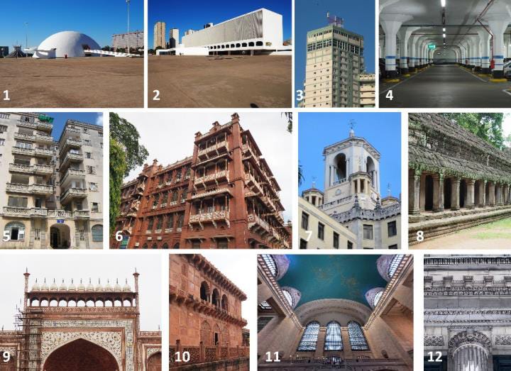
Below are the twelve images analyzed by Lavdas and Salingaros in the present paper:

The numbering in the selection above is not arbitrary, but rather reflects the relative position of each of the twelve images when evaluated on the Buras Beauty Scale, with 1 being least beautiful and 12 being most beautiful.
What is the Buras Beauty Scale? It is “an intuitive measure of visceral attraction” mentioned in Nir Buras’s 2020 book, The Art of Classic Planning. Buras credits his methodology to previous fMRI research by Hideaki Kawabata and Semir Zeki, in which participants ranked paintings on a scale from 1-10 and then looked at the same paintings later, while their brains were being imaged.
I’m not a neuroscientist, but one piece of the Kawabata and Zeki paper stuck out to me upon reading:
“In psychophysical experiments prior to imaging, each subject viewed 300 paintings for each painting category that were reproductions viewed on a computer monitor. Each painting was given a score, on a scale from 1 to 10. Scores of 1–4 were classified as “ugly,” 5–6 “neutral,” and 7–10 “beautiful.” Each subject thus arrived at an independent assessment of beautiful, ugly, and neutral paintings. Paintings classified as beautiful by some were classified as ugly by others and vice versa with the consequence that any individual painting did not necessarily belong in the same category for different subjects.”2
That is to say, the research on which the Buras Beauty Scale itself is based assumes a subjective experience of beauty.
Nevertheless, the Buras Beauty Scale uses a similar 1-10 scoring system to evaluate first reactions upon being shown an image. As described by Lavdas and Salingaros:
“The instructions for estimating the beauty scale…are natural and straightforward. We simply allow the neurological apparatus of the human body to decide on ranking the observed “beauty”. Subjects are asked to use their senses instead of any preconceived opinions to rate something:
‘Please rate this based on its visual appeal on a scale of 0 to 10—the first number that comes to your mind—with 10 being the most appealing.’”
How accurate or meaningful is this method for assessing things? If two people consistently arrive at different numbers for the same images, do we assume that one or the other of them is wrong? And if so, how do we know which one? All Google search results for “Buras Beauty Scale” point us right back to this very paper and the description given in Buras’ book provides no further clarity. Lavdas and Salingaros do give us the following bit of information: “Buras has used this tool for estimating architectural beauty, and has found roughly an 85% correlation among subjects (in numerous though undocumented examples).” Do with that what you will.3
Lavdas and Salingaros used the Buras Beauty Scale to generate the 1-12 rankings annotating the images above, with image 12 being the most appealing:
“Both authors independently estimated the ranking of each image on the beauty scale, and the results were averaged arithmetically and used for grouping the images in this presentation…These only come from two people and cannot be used for statistical analysis.”
While this should be easy enough for most to replicate, I'm not able to perform beauty scale assessments myself. (This preamble is already lengthy and we haven’t looked at very many buildings yet, so the explanation here is tucked away in the footnote at the end of this sentence.4)
The strategy I’ve arrived at instead makes use of the 2007 list of “America’s Favorite Architecture,” a project of the AIA and Harris Interactive. AIA members were surveyed and identified a pool of 248 “favorite” works of architecture in the United states. Harris Interactive asked 1804 American adults to rank images of these selected buildings on a scale from 1-5. From this polling, Americans’ 150 “favorite” buildings were identified and ranked. The 98 remaining buildings—those selected by architects but ranked in the top 150 by the general public—form a sort of counter to the main list, highlighting work which is critically (but perhaps not popularly) beloved.
All of this provides us a list of buildings and their relative level of appeal, which serves as a reasonable approximation of the Buras Beauty Scale. From the main list of 150, I have selected ten buildings in a variety of locations and styles. I’ve supplemented this with two selections from the other 98, arriving at the grouping of twelve shown below.

This list is ordered according to the rankings produced by the America’s Favorite Architecture survey, with the Salk Institute and Boston City Hall taken from the 98 “also-rans” and the other ten buildings selected from within the ranks of the top 150.5
I’ve selected two images of each building from the Wikimedia Commons collection, which gives us two different image sequences we can compare with the rankings from the America’s Favorite Architecture polling.
VAS and Pairwise Comparisons
Next, we need to set these images side-by-side and run them through VAS analysis in pairs, with the “less beautiful” image on the left.
Below are a few examples of these comparisons taken straight from the paper:


Lavdas and Salingaros tell us to look for the following: “The more engaging of the two images will draw the most attention in two distinct ways: the more “relaxing” of the two shows a more uniform VAS coverage, while the more disturbing of the pair reveals more red hot spots.”
Following Lavdas and Salingaros, I’ve unified the sky in each comparison and added a small buffer zone between and around the images. Below are two pairwise comparisons, each with an image of the Metropolitan Museum of Art on the left and an image of the U.S. Capitol building on the right.


To the extent that we can make such determinations at all, it sure looks like we’re getting conflicting results between the two pairs. There’s a higher incidence of red spots at the Met in our first comparison, whereas in the second image all of our red spot activity is on the Capitol.
Let’s try a few more options, perhaps with more drastic differences in architectural style and detailing. Here’s Boston City Hall and Cincinnati Union Terminal once again, this time as pairwise images analyzed together.

And here are the exact same base images as those above, but analyzed with Union Terminal on the left and City Hall on the right.


Once again, I’m having a hard time making a clear judgment here. Is Cincinnati Union Terminal or Boston City Hall the more engaging building? Union Terminal is number 45 on the list of America’s Favorite Architecture. Boston City Hall doesn’t crack the top 150.
For their own images, Lavdas and Salingaros conclude “the present diagnostic imaging method is therefore consistent with the intuitive ranking obtained from the Buras beauty scale.” I don’t think this conclusion follows from the pairwise images I’m looking at. I’ll be looking a bit more at the pairwise comparison methodology in a future installment in this series, so let’s move on.
VAS and the Visual Coherence Index
Within the body of VAS-and-architecture research there’s an inconsistency over what a “good” heatmap result should show. Red hotspots are an indication of engagement, which can be good or bad. A uniform, soft blue glow is a good sign, except for when it isn’t.
Some of this is to be expected: VAS is designed to measure attention, not comfort or pleasure, and it’s natural to pay attention to threats in our field of view as much or more as sources of delight. It would help to have an objective rubric for understanding these results and comparing them across visual inputs, lest the “readings” of VAS results take on too subjective of a character.
To help get closer to this objective ideal, Lavdas and Salingaros propose something called the Visual Coherence Index for each heatmap. Lavdas and Salingaros define this value, R, as:
R = % coverage/(red spots + non-contiguous regions)
with all values measured across the portion of the image containing the building in question (to avoid introducing hotspots around cars and vegetation).
To compute these values, they make use of another software tool, ImageJ. ImageJ is a public domain tool for image analysis developed by the National Institutes of Health and the Laboratory for Optical and Computational Instrumentation. It has quite a few capabilities, many of which are designed around converting images into quantitative data: how many cells are in this image? what percentage of this leaf has turned brown?
In contrast to VAS, ImageJ has a large body of public documentation available for anyone to read and digest. It’s easy to discover exactly what’s going on under the hood for any given process or analysis one performs.
The images analyzed here are not the pairwise comparisons from earlier, but instead individual, standalone photographs. Lavdas and Salingaros:
“For practical use, we combine the three numbers measured from the VAS heat map for each image into a visual coherence index…to obtain a single number ranging from 0 to 100. The original image results in what is labeled here Rfar. A second “Rnear” is calculated for a second set of images, “zoomed in” by a constant factor, and the proportion of Rnear over Rfar is calculated. This number is taken as a computed numerical measure for one aspect of architectural beauty.”
This notion of zooming in has to do with ideas of symmetry and complexity working at multiple scales. We can find plenty of examples of natural forms like trees and mountain ranges exhibiting fractal or fractal-like geometries. The line of argument advanced here is that buildings which exhibit this type of formal organization are more appealing than those which don’t because they feel “natural” to our eyes. Lavdas and Salingaros explain:
“This measure reveals how the coherence of the design transforms as the viewer approaches, and taps into the fractal processing of the eye-brain system. As we have shown before, many buildings may present a homogeneous VAS coverage that disintegrates upon approach. A high number for this ratio is the best VAS correlate of organized complexity-based coherence. Organized complexity requires nested symmetries within a scaling hierarchy: the above number ratio measures whether such a hierarchy is likely to exist.”
One theme I’d like to highlight throughout this series is how far removed VAS image analysis is from the actual act of looking at a building. When looking at a multi-story building (as almost all buildings examined in these papers are), one’s line of sight typically moves above their own eye level and aims for the center of the facade (view 1 in the image below). Zooming into a photograph, as Lavdas and Salingaros do here, brings us closer to view 2, whereas the figure demonstrating view 3 is a better reflection of the action of seeing a building from two different distances.6

But—leaving that aside—it’s still possible to compute the Visual Coherence Index for the twelve buildings I selected earlier. And dear readers, I have done exactly that. Before getting into the results, let’s look at what Lavdas and Salingaros found in their data. The initial twelve images are also reposted below, to save everyone a lot of scrolling up and down.

The 1-12 ordering above corresponds to the Buras Beauty Scale rankings. To my eyes, there seems to be no real trend or correlation between Visual Coherence Index values and this allegedly-intuitive ordering. How serious an issue this is for this method of analysis depends primarily upon which section of the paper you’re reading.
From section 3.11 From the Visual Coherence Index to the Beauty Scale:
“It would have been nice to be able to compute a number derived from the index R…measured at various magnifications, and correlate that to a rating on the beauty scale for that image. However, as everyone who has seriously attacked the problem of architectural beauty already knows, there are more factors that contribute…The present quantitative method is merely a beginning pilot study that focuses on what can be done with the VAS and ImageJ software.”
From section 5.1 Objective Architectural Beauty:
“Our method supports an objective measure of perceived beauty, since the Visual Coherence Index R can be measured by using computer processing of VAS scans, themselves the products of a computer program.”
From section 7 Conclusions:
“A synthesis was created of many disparate topics that include our own previous discoveries together with those of other researchers. Practitioners can feel confident in applying the tools presented here to their projects in estimating objective architectural beauty, even partially.”
My position is that practitioners should not feel confident that the data generated by these tools is a reliable estimate of anything like “architectural beauty.” I firmly believe that it’s healthy for our understanding of science for researchers to try something, realize it doesn’t work quite as predicted, and share that information with the world. I’m far less convinced of the value of concluding “hey, this tool is a reliable predictor!” when the data demonstrates the opposite.
But I’m getting ahead of myself. Let’s analyze some more images.
Below are the VAS results for the two image sets introduced near the top of this post. Each building is analyzed via photographs taken from two different views. For the first image set, I did the zooming in and cropping thing as described in the paper and ran those zoomed in versions through VAS. I did the same with the second set, but created two variants from each initial image, changing only the area of focus that I zoomed in on. All images were set to 1200px wide and processed using the “Other” setting within VAS. (Refer to the first post in this series for more on the different analysis settings.)

All the data in the chart below comes from ImageJ analysis of the images above.7 Lavdas and Salingaros don't give specifics on which settings and values they used for their thresholding and hotspot counting.8 Also ambiguous in the original paper was the issue how exactly to parse which parts of the image count as building and which don't. Facades are fairly straightforward, but things like plazas and entry steps are more ambiguous, which ultimately required some judgment calls.9
It took me a few minutes per image to click through the various steps: defining the building as a Region Of Interest within the image; running the Color Threshold operation to determine heatmap coverage; using the Analyze Particles tool to measure that coverage percentage and count its non-contiguous regions; resetting and running the Color Threshold operation for red hotspots; and using the Analyze Particles tool again to count the number of discrete red hotspots within the region of interest. (With a bit of tinkering I’m sure it would be possible to put together a macro to automate most of that, or even recreate the calculations within Photoshop to streamline the whole process.)
First up, the Visual Coherence Index values for every image in its initial, zoomed-out state (aka Rfar):

Looking at these numbers and looking at the source images, I can’t discern any real patterns. With only two data points per building, that’s not particularly surprising and I don’t think we can draw too many conclusions here.
Next up are the ratio calculations with the zoomed-in images, comparing how the values shown above change when only a smaller detail of the image is analyzed. The authors tell us that a higher number here reflects a higher amount of coherence demonstrating organized complexity. Put another way, a building like Boston City Hall could seem from a distance like it exhibits a high level of visual coherence, but if the zoomed-in values drop precipitously then our first perception was illusory. An Rnear/Rfar ratio between 0 and 1 reflects this sort of decreasing visual coherence. Where Rnear/Rfar is greater than 1, we have increased coherence on closer scrutiny. If the value equals 1, then our coherence is consistent across the two zoom levels.

Looking just at Image Set 1, we can see that some buildings which demonstrated high Visual Coherence Index values when zoomed out (Boston City Hall, Air Force Academy Chapel) have pretty low Rnear/Rfar values. Conversely, the Salk Institute and the Old Faithful Inn (the buildings with the lowest initial Visual Coherence Index values) are the only buildings which demonstrate increasing visual coherence upon zooming in.
This might give us some deep insight into the nature of architecture. Or it might just be a fairly predictable effect of setting up the equations this way. A particularly low Rfar value in the denominator will all but guarantee a high Rnear/Rfar value, and vice versa.
Image Set 2 presents its own challenges to Visual Coherence Index boosters. I changed nothing at all about the Guggenheim Museum photo (or any of the other photos) except for where I centered the zooming in. That adjustment alone made the difference between a decrease in visual coherence and an increase. Not the weather or the surroundings. Not the location of the camera or the exposure or image resolution. Just the portion of the photo selected for zooming and cropping.
Without scrolling up to check, can you tell which of the zoomed-in snippets of the image below represents decreasing visual coherence?10

I‘m open to the suggestion that, given a large enough set of images for each building, some kind of patterns may begin to appear. I’m planning a deep dive into the relationship between various elements of source photographs (lighting, vegetation, cars, etc.) as a future part of this series, and I may revisit this issue at that time. For the moment, I can’t tell if this Visual Coherence Index and the near/far comparisons are measuring anything meaningful.
From their own experiments, Lavdas and Salingaros tell us:
“One building having more coherence in its zoomed-in detail always means that it profits from fractal/scaling symmetries as compared to a minimalist, non-detailed building…In a minimalist, non-detailed building, there is no detail to zoom into.”
That the Salk Institute and the Guggenheim Museum outperform the US Capitol and Trinity Church in these experiments seems to cast some doubt on this assertion, this methodology, or both.
Concluding Thoughts
“A number of alternative definitions of architectural beauty—all of them subjective and based on different criteria—are equally possible. An enormous though unresolved problem confronting the world of building today is that academia and the profession pick out one of those alternatives, but then present it as objective beauty. It is not.”
Believe it or not, the above passage comes from this very same paper!11
I think Lavdas and Salingaros are right to highlight this tendency. I also think they fail to notice it playing out in serious ways in their own work.
Remember the methodology here: Lavdas and Salingaros selected the photos of buildings they wanted to examine and the stylistic categories of buildings they wanted to exclude entirely. Lavdas and Salingaros rank-ordered the buildings based on their own two-person implementation of the Buras Beauty Scale. They developed the idea of and the equations behind the Visual Coherence Index. Where the results support their premises, it’s presented as a validation of the underlying framework. Where they differ, it’s an indication of the need for more and larger studies.
I’m more than a little apprehensive about the idea that we can measure, quantify, and moneyball every aspect of the architectural experience. But if that’s the direction we’re heading, I hope we can all show a bit more patience and and a lot more rigor before declaring success or failure.
—THA—
In the next installment, I’ll look at a 2021 paper by Lavdas, Salingaros, and Ann Sussman and unpack a bit more of what makes a “good” input image for VAS work. To get that post in your inbox as soon as its ready, you can subscribe via the button below. All this stuff will always be available on the ‘free’ tier, so only go for the paid subscription if you feel particularly generous. (It’s never expected but always appreciated.)
Lavdas, Alexandros A., and Nikos A. Salingaros. 2022. "Architectural Beauty: Developing a Measurable and Objective Scale" Challenges 13, no. 2: 56. https://doi.org/10.3390/challe13020056
Kawabata, Hideaki, and Semir Zeki. 2004. “Neural Correlates of Beauty” Journal of Neurophysiology 91, no. 4: 1699–1705. https://doi.org/10.1152/jn.00696.2003
The paper continues:
“Concordance among different subjects in evaluating the specific type of architectural beauty outlined here, and among different methods for estimating or measuring it mirrors the hypothesis of measurable objective features of perceived beauty (which constitute what we will call, from now on, “objective beauty”. In a statistically significant study using many images and subjects, the values for the beauty scale of a particular image estimated by different subjects will need to be combined, and the deviation computed. The robustness of the data will depend upon the inter-rater reliability. At the moment, the Buras test is an intuitive measure that some researchers use to estimate objective beauty, but it has not been statistically verified. A study is now underway to validate it under controlled conditions.”
I look forward to seeing the results of that study when it’s complete!
Why can’t I make meaningful assessments according to the Buras Beauty Scale? Because I went to architecture school.
Lavdas and Salingaros tell us that “[the Buras Beauty Scale] has proven to work well for a range of individuals not trained as architects, but it can lead to contradictory results when architects apply it.”
In section 6.3 of the paper (“Why the Beauty Scale Generates Cognitive Dissonance in Architects”) the authors elaborate on this assertion. The main contours of the argument are preserved in the long quote below:
“Architects have trouble with the beauty scale as a consequence of their training, and voice an opposite opinion from their built-in biological instincts. Asking the beauty-scale question sparks cognitive dissonance since modernist tradition teaches a predisposition that reverses unconscious responses. Architects are taught a subjective set of aesthetics, and at the same time, they have to suppress their innate sensory experience in favor of a learned preference…”
“Architectural education uses operant conditioning to achieve the unnatural goal of devaluing biological beauty. Confronted with “approved” styles with minimal values of objective beauty, students are rewarded for propagating them, and become afraid of their own innate ability to feel pleasure from sources of coherent complex information…”
“The neurological pathways that encode valences (i.e., bad versus good emotional associations) are known…For the past century, architectural education has focused on training exercises that achieve emotional numbing with respect to the environment, as a means to switch valences. Prior conditioning explains why design professionals show insensitivity to the feelings of users inhabiting their work.”
I don’t find this argument to be particularly convincing, nor a particularly accurate reflection of my own time in architecture school. I’m sure going to architecture school has influenced how I look at buildings, just as going to medical school would influence how I look at the human body or getting forklift certified would influence how I look at forklifts. I don’t know where subject matter expertise ends and brainwashing begins, but for the purpose of this post I’m happy to find another source for ranking pictures of buildings.
The list of “America’s Favorite Architecture” includes some structures (for example, the Golden Gate Bridge and the Washington Monument) which function more akin to sculpture and infrastructure than as occupiable spaces. I decided not to include any of these buildings in my own testing. I also looked outside of the “Top Ten” in order to build a more formally and stylistically rounded list. The original rankings and the relative position of each of the 12 selected buildings used in my tests are below:

Some of this may sound like splitting hairs and it’s true that none of these limitations are by themselves disqualifying. But taken together they’re discouraging. What we have here is an imperfect algorithmic simulation of laboratory eye-tracking looking at one single image cropped and zoomed as an imperfect simulation of having multiple images (which is itself an imperfect simulation of a continuous visual experience). At some point all of this hits a point where it’s no longer a meaningful representation of anything in the real world.
Want any of these raw images, processed images, or data for yourself for your own experimentation and number crunching? I’d be more than happy to share. Send an email to: the.hustle.architect@protonmail.com for more info.
I stuck to the default ImageJ settings for the most part, but only counted post-threshold hotspots larger than 50 pixels square to avoid counting small artifacts left by VAS.
For example, I decided that the main plaza of the Salk Institute was part of the building whereas the wide paved expanse in front of Boston City Hall wasn't. These sorts of determinations will impact the results and I welcome any spirited debates and/or clearer 'rules' around how to perform this analysis rigorously. Anyone using this software "in the field" ought to have clarity around this sort of stuff for results to be meaningful.
It’s the one on the right!
It provides the transition between an assertion of VAS’s objectivity and a discussion of the work of Christopher Alexander. I haven’t touched most of the Alexander stuff in this line of research, and probably won’t. Its use as a theoretical underpinning for how and why VAS works for understanding architecture is only valuable if VAS does in fact work for understanding architecture. I remain unconvinced that it does.