
Angels in the Architecture (interlude pt ii)
On the limits of 3M's Visual Attention Software in architectural research

[This is a brief continuation of Wednesday’s post. Consider clicking over to the Substack site if the images won’t load fully in your inbox.]

The other night while trying to fall asleep it occurred to me that I ought to go into a bit more detail on the possibilities and perils of making comparisons between different eye-tracking simulation softwares, perhaps with the help of some diagrams.
This post a quick pass at those diagrams, in a way that I think can also give a bit more general insight into what I look for when I look at images analyzed by VAS (or any of the other eye-tracking sims).
One of the central claims of VAS-based architectural research is that there exists some natural, more-or-less-universal way in which humans see the world around them, long-obscured but now made visible to us through technology.
For example:
“This extremely powerful tool reveals how people have an innate form bias that directs us subliminally, and which we cannot control. Actual eye tracking and simulation software distill the neuroscience that today’s architects and planners do not yet know.”1
and
“Design is a complex and intricate process whose success is contingent upon many forces. The present diagnostic tool does not resolve all problems related to the adaptiveness of design, but it reveals key forces in the visual field for the first time, as part of a helpful method towards humanizing architecture. Those forces were always there, influencing how users interact with a building; however, we were never able to visualize them.”2
and
“This study shows how biometric tools, like VAS, can be instrumental in getting designers, planners, developers, and the general public to ‘see’ a biological fact: unconscious processing directs our experience of the built environment.”3
In this framework, VAS is a tool which helps us to see something latent but invisible to the naked eye, not entirely unlike a metal detector or a thermal-imaging camera.
A tool like a metal detector, to continue the analogy, permits certain kinds of variation and not others: one model may be more sensitive than another, or have a wider range, or make different sounds, but all are united by the ability to reliably and repeatedly detect metals. Likewise, two thermal-imaging cameras operating on the same settings and pointed at the same heat source ought to produce pretty similar results, regardless of brand or model.
When the results produced by different imaging tools pointed at the same view vary, it’s worth digging deeper to see more of what’s going on. Some variations are almost inevitable—the natural result of different manufacturers and different machine capabilities. If we see variations that aren’t explained by this dynamic, that should give us pause. Let’s look at some diagrams:

Here’s a simple city scene with an imaginary VAS-like heatmap superimposed. (No images in this post use any actual algorithm-derived results—these are all just quick illustrations of patterns I’ve noticed while looking at a lot of this research. Consider everything which follows as ‘not to scale’ but still reflective of the general idea.)
The first post in this series described how we can think of a digital image as a sort of multi-layered spreadsheet, with each pixel having a location (x, y) and a set of RGB values (233, 219, 180). The heatmaps generated by a tool like VAS work more or less the same way: each pixel is assigned a value like “probability of being seen in the first 3-5 seconds.” That probability then gets mapped to a color and/or transparency value, and the arrangement of all those values together makes a heatmap.
Consider a hypothetical, VAS-like “Simulation Tool Alpha” whose probability-to-pixel value mapping process looks like this:
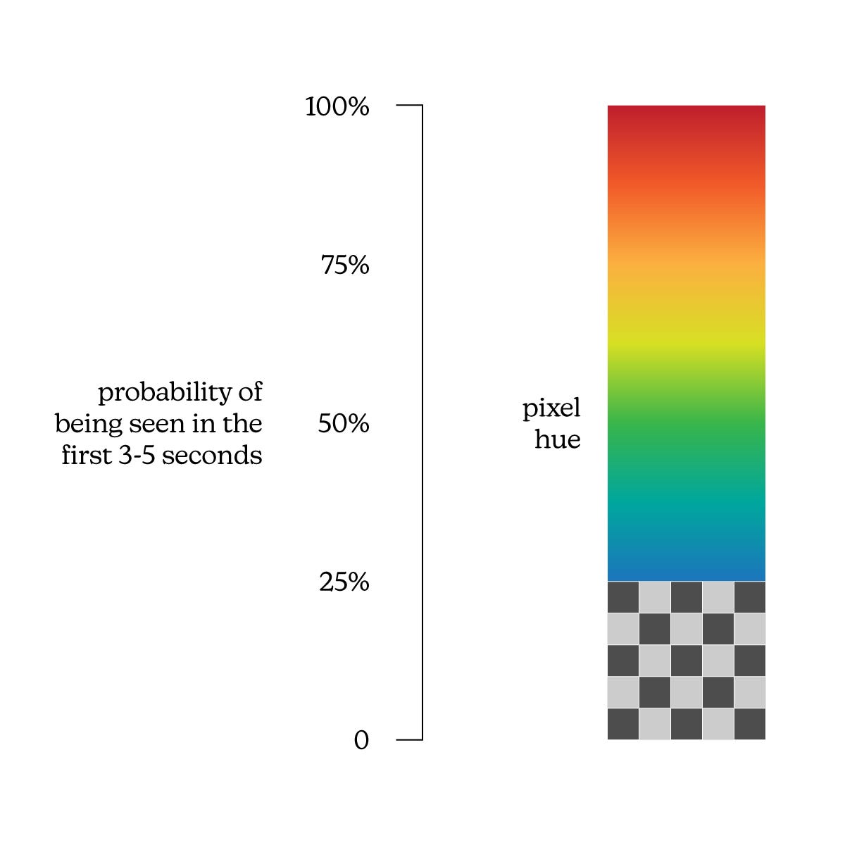
A higher probability of being seen in the first 3-5 seconds will mean a shift toward the red end of the spectrum. Below 25% probability, pixels are made fully transparent to indicate a predicted lack of attention/visibility.
In addition to Simulation Tool Alpha, lets introduce 3 more eye-tracking simulation tools: Beta, Gamma, and Delta. At this stage they all work exactly the same way, with the only difference being how the mapping from a probability to a pixel hue is calculated:
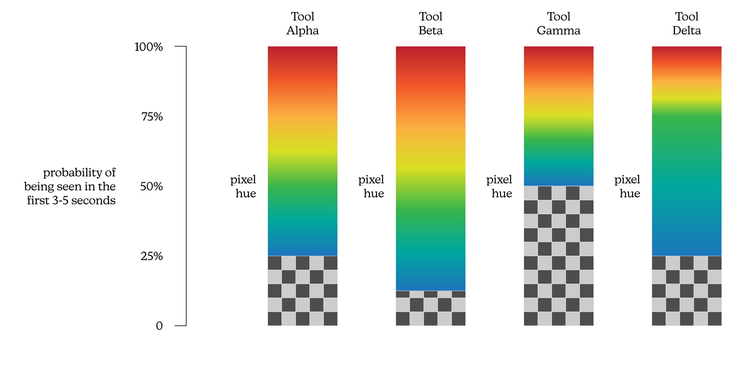
In this scenario, we can put in our initial image and expect to see results from the four different tools with the type of variation exhibited below:

Or something like that, anyway. While the threshold levels are different, the concordance between the four mappings is evident: the outlines are roughly congruent, the maximum intensity is located in the same place, and so on. This sort of thing is expected when using the same tool made by different manufacturers.
Another type of variation we might expect to see is differences in the visual language of the heatmap. Suppose Tools Alpha, Beta, Gamma, and Delta all used a standardized conversion from probability to pixel hue, but along the way introduced some cosmetic differences in how those pixels themselves were rendered. Maybe this means masking the transparent pixels in a dark grey, or switching to a different color scheme for the gradient itself. A few examples of this sort of thing are sketched below.

Here, too, we can identify commonalities in the overall structure of the output despite the differences in its surface-level presentation. This is normal!
One last expectation we might have is subtle differences in the actual output data itself. With all other factors held constant, this would look something like the diagram set below:

In the case of eye-tracking simulation, these discrepancies would arise from differences in the AIs making the predictions, not anything to so with the conversions of those predictions into visual data. Slight differences in how each tool calculates probabilities for each pixel would mean slight differences in each overall heatmap appearance.
As for VAS and its commercial competitors, it would be surprising if we didn’t see this. Each of these tools is a proprietary method of analyzing images and each works with slightly different parameters, so a pixel-for-pixel match between products would mean either a wild coincidence (extremely unlikely) or corporate espionage (frowned upon). But, crucially, they’re all supposed to be measuring the same thing—human attention.
Working in combination rather than isolation, the three genres of variation discussed above can produce some fairly dissimilar images. Imagine our Tools Alpha, Beta, Gamma, and Delta go in four different directions, each making independent decisions about color thresholds, visual language, and the underlying computations that produce the output data. Even with all this, some commonalities ought to persist across all of our results:

Even if the image underlay were removed entirely, we could pick out features and focal points common to each “analysis” above. There are some outliers, some differences in magnitude, but the overall structure is broadly the same.
For an everyday example of this sort of thing, let’s look at the weather. Substack tells me that most readers of these posts are US-based. Below are four radar maps of the weather that US readers will be experiencing this morning.

These representations of radar data use different color schemes. They use different map projections and labeling strategies. They appear to pick up different incidences of precipitation off the coast of Washington and Oregon. But leaving my house in southeast Michigan, I can have a reasonable degree of confidence that I’ll need a jacket no matter which map I look at.
This effect is what I hoped to see replicated when analyzing actual images of buildings with actual eye-tracking simulation tools on the market today. Here are the results from my quick investigation the other day, shrunk down to fit into one matrix.
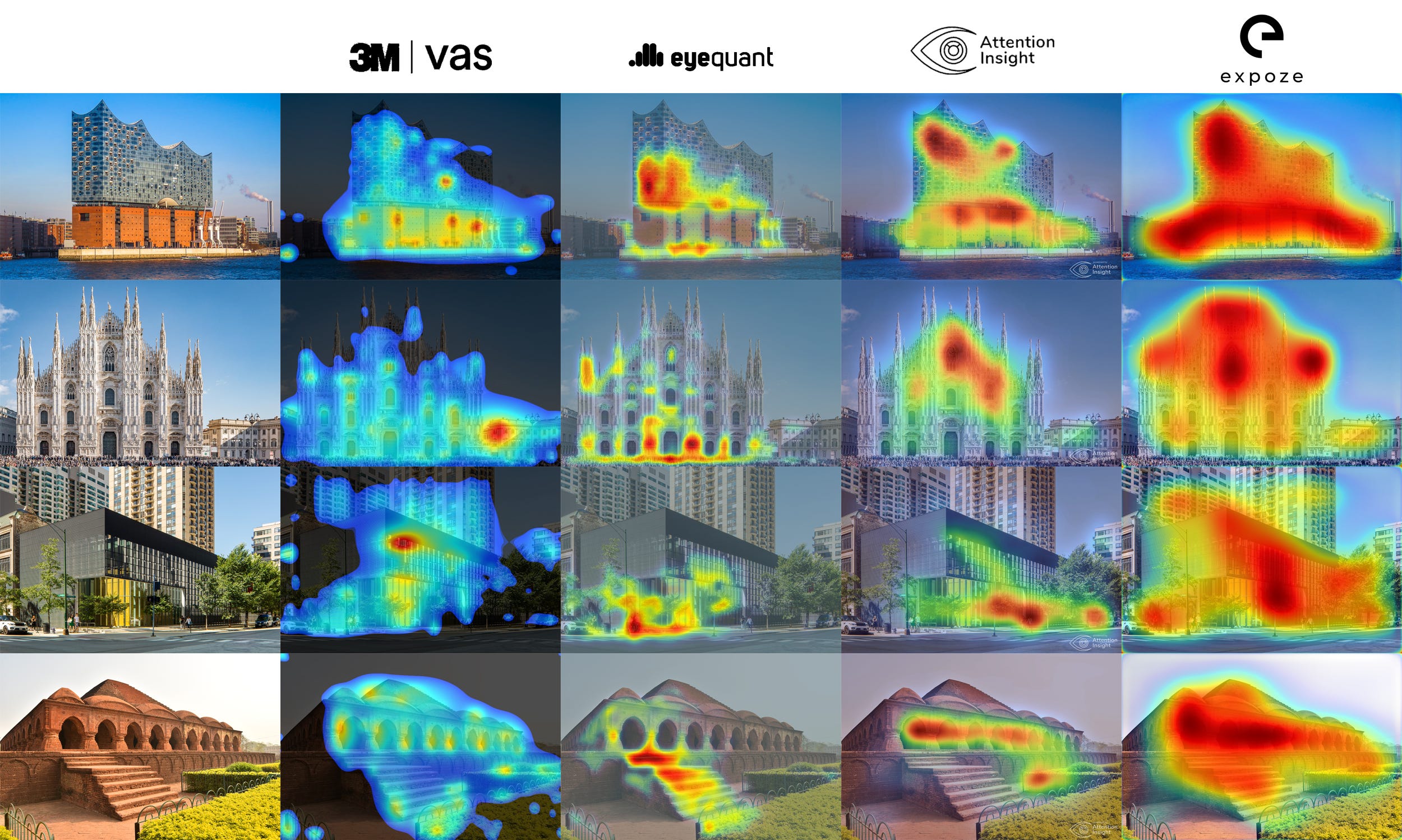
I can see certain similarities here and there: Attention Insight and expoze.io in how they analyze the Elbphilharmonie, or the general outlines produced by VAS and expoze.io. But these similarities are rough and low-resolution relative to the details of the images themselves. (Which are, again, flattened static representations of the complex, multidimensional and multisensory experiences that define architecture…)
All of which is to say—even if we accept the caveat they’re different tools, of course they’ll look a little different—there’s just far more variation here than should be expected. If eye-tracking simulation reveals some latent landscape shaping our attention then the results should correspond regardless of their maker.
That’s the difference between a metal detector and a dowsing rod.
—THA—
Lavdas, Alexandros A., Nikos A. Salingaros, and Ann Sussman. 2021. "Visual Attention Software: A New Tool for Understanding the “Subliminal” Experience of the Built Environment" Applied Sciences 11, no. 13: 6197. https://doi.org/10.3390/app11136197
Lavdas, Alexandros A., and Nikos A. Salingaros. 2022. "Architectural Beauty: Developing a Measurable and Objective Scale" Challenges 13, no. 2: 56. https://doi.org/10.3390/challe13020056
Hollander, Justin B., Ann Sussman, Peter Lowitt, Neil Angus & Minyu Situ. 2021. “Eye-Tracking Emulation Software: A Promising Urban Design Tool” Architectural Science Review, no 64: 4. 383-393. http://doi.org/10.1080/00038628.2021.1929055